
Introduction
Descriptive statistics is one of the ways to describe the data. In data science, descriptive statistics are used to provide an overview of a huge data collection. It's used to see if the data is normally distributed or not. It is presented in the form of a chart, graphs, table, frequency distribution, and so on. It provides information on summary statistics that includes Mean, Standard Error, Median, Mode, Standard Deviation, Variance, Kurtosis, Skewness, Range, Minimum, Maximum, Sum, and Count.
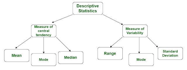
Two major information is provided by Descriptive Statistics regarding the data:
- The measure of Central Tendency
- The measure of Dispersion
 |
| Descriptive Statistics |
Descriptive statistics answer the following questions:
- What is the value that best describes the data set?
- How much does a data set speads from its average value?
- What is the smallest and largest number in a data set?
- What are the outliers and how it affects the dataset?
Measure of Central Tendency
It describes a whole data column with a single numerical value which represents the center of the distribution. There are three main measures of central tendency: the mode, the median, and the mean.
 |
| Mean, Median, Mode, and Range |
Limitation of mean:
- It is affected by extreme values.
- Very large or very small numbers can distort the answer.
Advantage of median:
- It is NOT affected by extreme values.
- Very large or very small numbers do not affect it.
Advantage of mode:
- It can be used when the data is non-numerical.
Limitation of mode:
- There may be no mode at all if none of the data is the same.
- There may be more than one mode.
By now, everyone should know how to calculate mean, median, and mode. They each give us a measure of Central Tendency (i.e. where the center of our data falls) but often give different answers. So how do we know when to use each? Here are some general rules:
- Mean is the preferred measure of central tendency when:
- It is the most frequently used measure of central tendency and is generally considered the best measure of it. However, there are some situations where either median or mode are preferred.
- When your data is not skewed i.e normally distributed. In other words, there are no extreme values present in the data set (Outliers)
- Median is the preferred measure of central tendency when:
- There are a few extreme scores in the distribution of the data. (NOTE: Remember that a single outlier can have a great effect on the mean).
- There are some missing or undetermined values in your data.
- There is an open-ended distribution (For example, if you have a data field that measures several children and your options are '0', '1', '2', '3', '4', '5' or '6 or more'. Here, the '6 or more' field is open-ended and makes calculating the mean impossible since we do not know exact values for this field).
- You have data measured on an ordinal scale (ordered categories). Example: Likert scale -- 1. Strongly dislike 2. Dislike 3. Neutral 4. Like 5. Strongly like)
- Mode is the preferred measure of central tendency when:
- Data are measured on a nominal (unordered categories) and even sometimes ordinal (ordered categories) scale.
Measure of Dispersion
It refers to the spread or dispersion of scores. There are four main measures of variability: Range, Interquartile range, Standard deviation, and Variance.
 |
| Measure of Dispersion |
As two features may have the same mean, median, and mode, a measure of central tendency is insufficient to accurately characterize the data. As a result, knowing the dispersion Measure is essential. It explains how the data changes.
The various measure of dispersion:
- Range
- Mean absolute deviation (MAD)
- Variance
- Standard deviation
- Coefficient of variance
- Coefficient of skewness
Range:
The range gives information about how much spread the given data has. The calculation of range is very simple, use the following formula:
- Maximum value - Minimum value
Advantages:
- Easy to calculate.
Limitations:
- It is very sensitive to outliers and does not use all the observations in a data set.
Mean absolute deviation (MAD):
Mean Absolute Deviation is the average distance between each data value and mean. To calculate MAD use the following formula:

Variance:
It gives us an understanding of how far the Data is from the mean.
- High variance means data points are very spread out from mean, and from one another.
- Low variance means data points are close to each other and to the mean.
To calculate mean use the following formula:


Standard deviation:
Standard deviation is nothing but a square root of variance. It is used to quantify the amount of dispersion of a set of data values from the average(mean).
- Low Standard Deviation means most of the Data values are close to average.
- High Standard Deviation means data values are far away from the mean.
To calculate Standard Deviation, first, calculate the variance and then find the square root of it.

Advantages:
- It gives a better picture of your data than just the mean alone.
Limitations:
- It doesn't give a clear picture of the whole range of the data.
- It can give a skewed picture if data contain outliers.
Sources: ListenData, Medium, LumenLearning
Reach me on LinkedIn
Comments
Post a Comment